Project Overview
Through its online blog on six-group.com, SIX aimed to distribute thought-leading, understandable content to drive brand awareness in channels relevant to their audience.
The upcoming discontinuation of the printed corporate magazine RED increased the significance and importance of their online blog for driving knowledge channels.
The old online blog was intended to enhance awareness and attraction but was outdated and did not provide users and editors with the right infrastructure to reflect the complexity of the magazine RED.

The Challenge
• Unknown content expectations for categories by the target audience were unknown.
• Ensuring and maximizing the exposure and discoverability
of articles and topics.
• Identifying basic blog features that motivate users to click on articles
• A new and modern overall blog design for SIX was required to house the new content organization.

The Goal
To redesign the SIX blog's information architecture by introducing a content cluster that allocates articles into distinct categories and multiple topics, with a new design that motivates users to browse and discover its content.

Impact
Through a redesign of the information architecture and the integration of a content cluster, we improved the user experience of the SIX online blog. With the introduction of multiple categories and a topic tag system, users can now easily search for and discover articles within specific categories and related topics.
By using multiple UX methods, such as card sorting, tree testing for the content cluster, and early design preference testing, we ensured that we stayed on track throughout the process.
The handover included 10 mid-fidelity wireframes (mobile & desktop) for all key blog levels, from the homepage to individual articles, providing all the visual information needed for production by SIX."
My design ultimately went live in the fall of 2023. Check it out!
My design ultimately went live in the fall of 2023. Check it out!
Here are some impressions from the final designs:
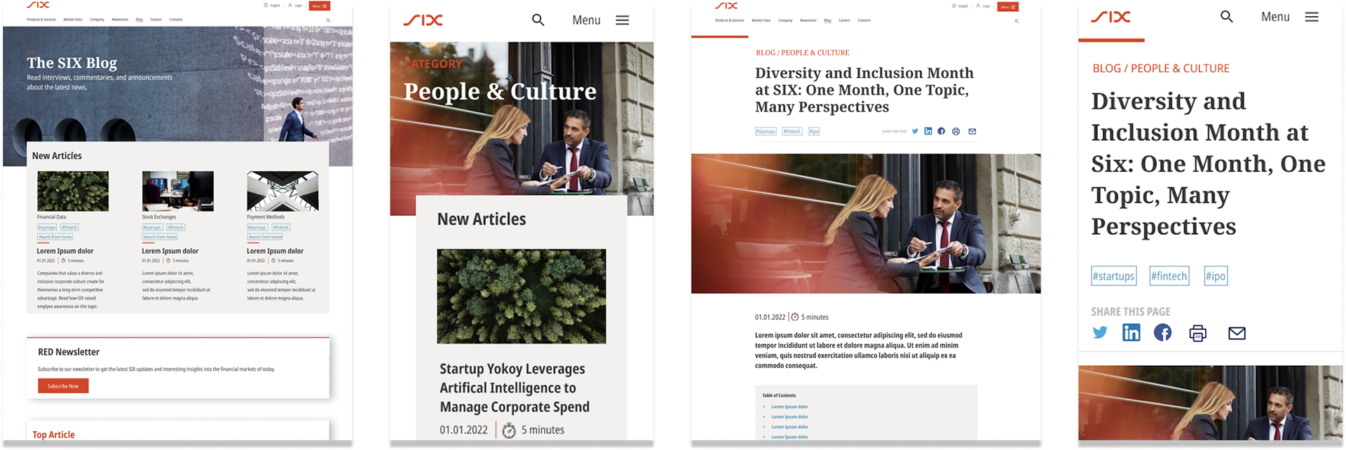
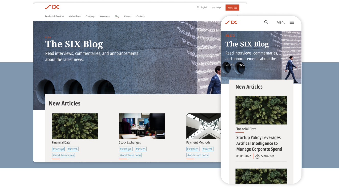
Blog Homepage (desktop & mobile)
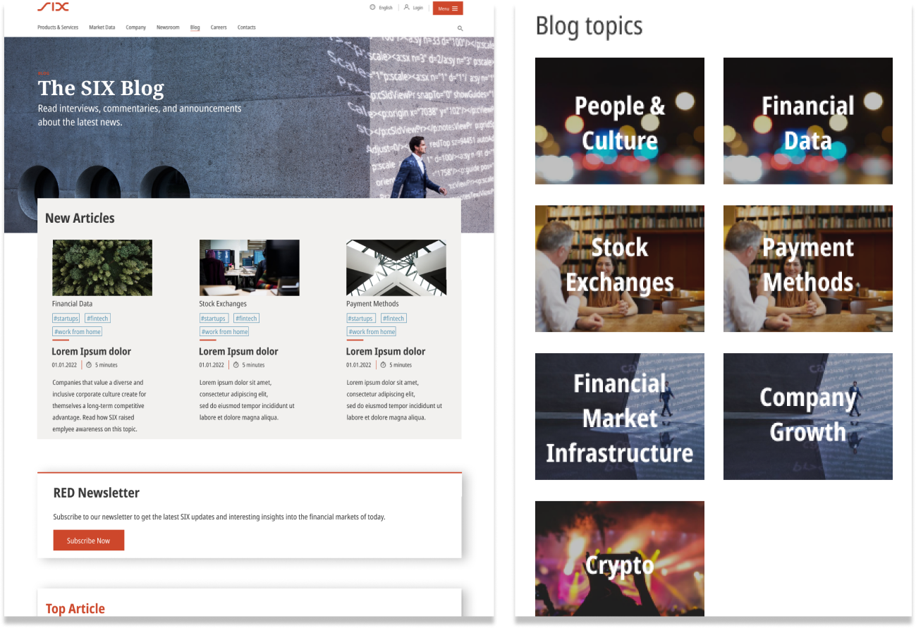
Blog Category level landing page (desktop & mobile)
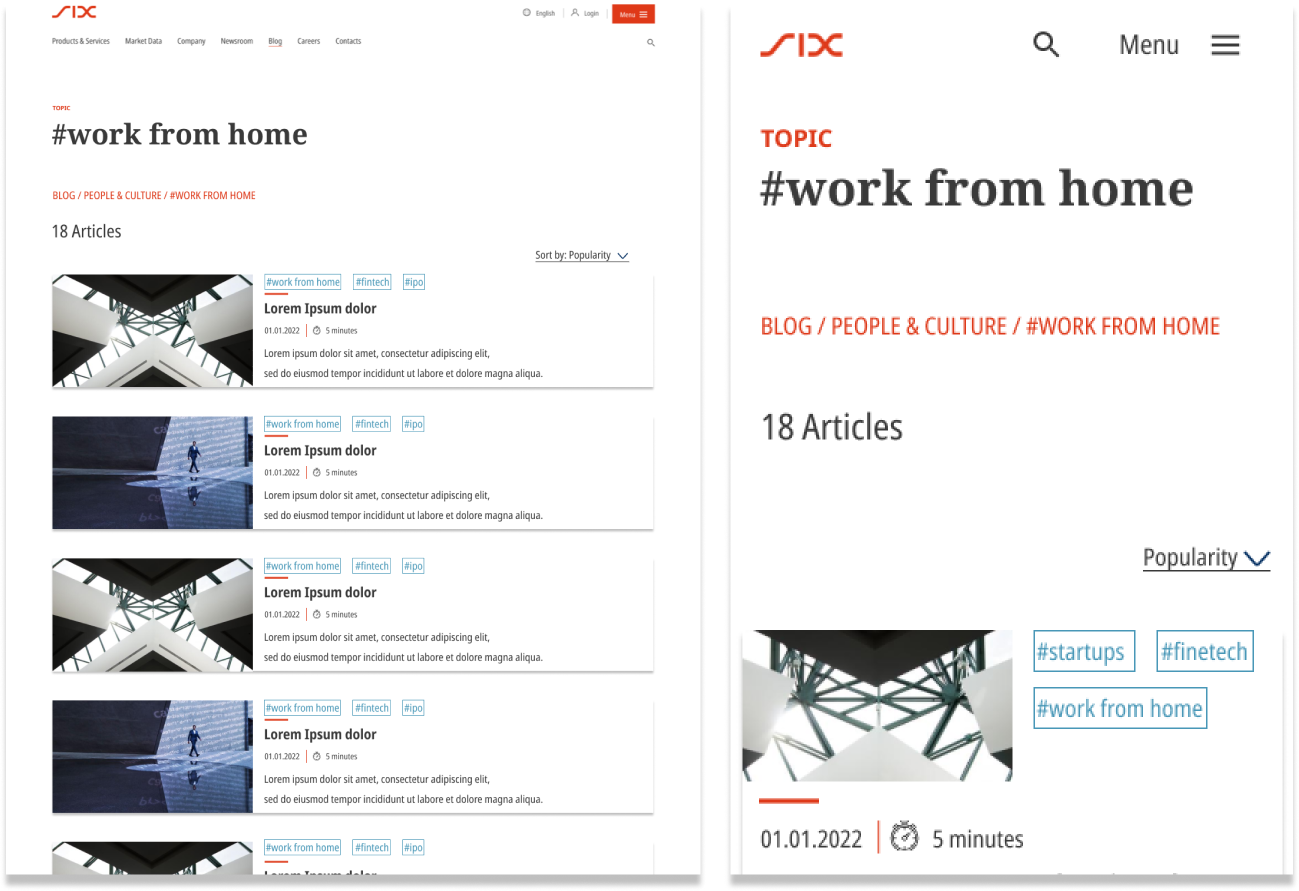
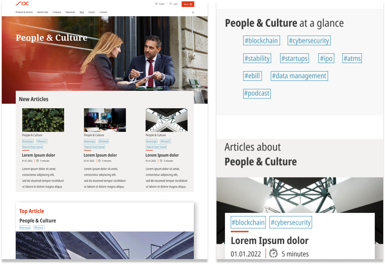
Blog Tag level landing page (desktop & mobile)
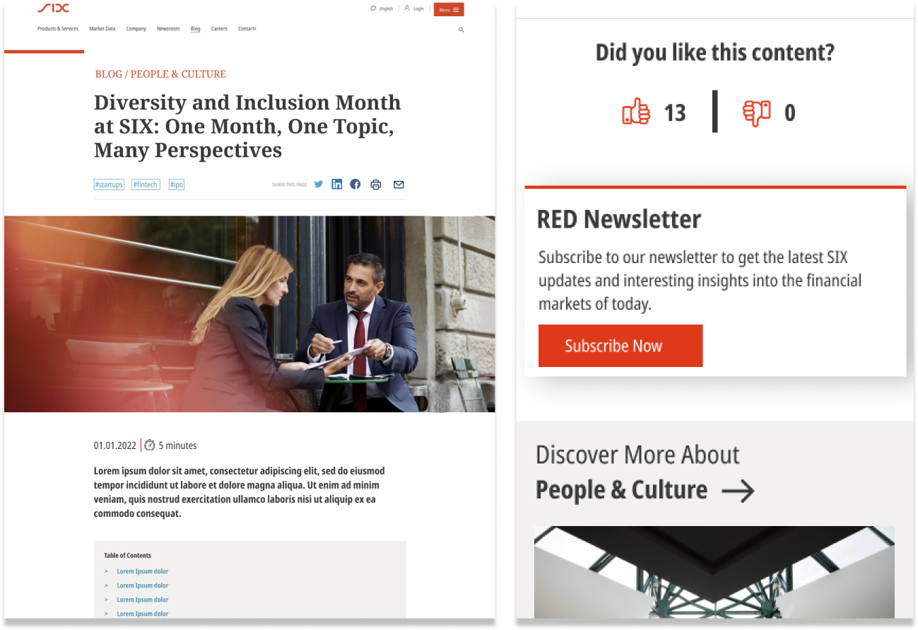
Blog Article level landing page (desktop & mobile)

Initial Situation
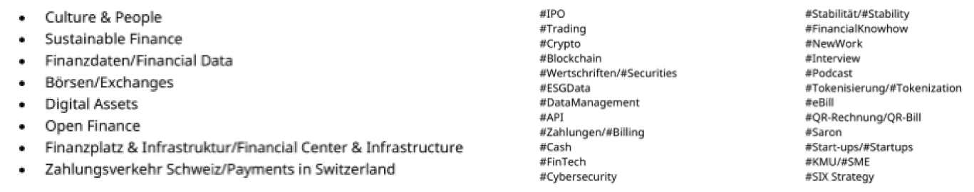
In a kickoff workshop, SIX-group provided us with a proposed set of categories and topics to categorize blog articles that reflects the upcoming content strategy in their point of view.
These categories and topics were highly technical, and it was unclear if future readers would understand what to expect from them.
I faced two major challenges:
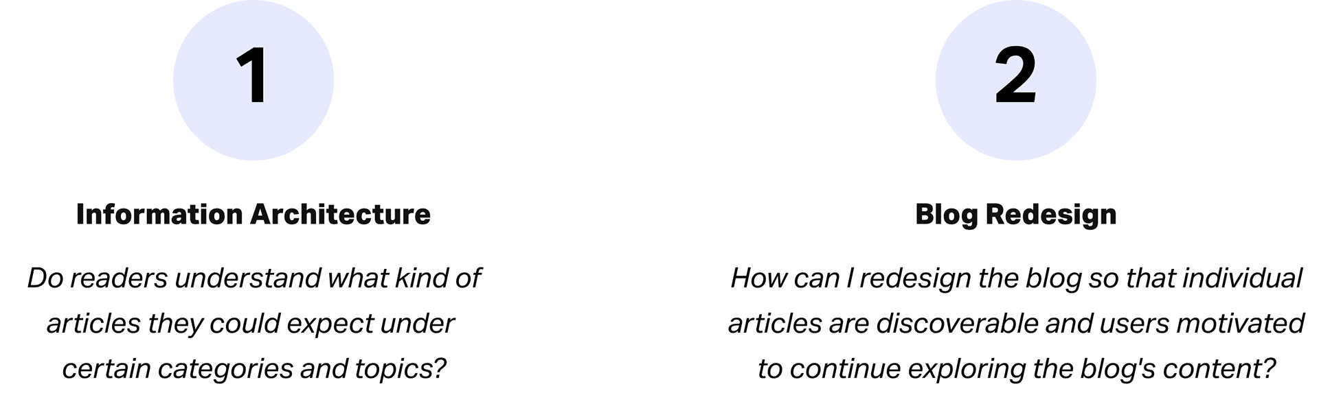

Challenge 1: Information Architecture
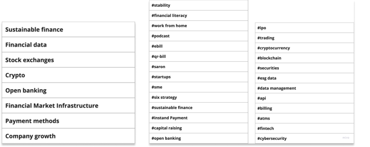
SIX provided me with an initial list of 8 blog categories and 24 topics...
Card Sorting
With the help of a remote closed card sorting exercise, I evaluated whether the proposed topics were collectively associated by users with specific categories.
If a category shows high uncertainty regarding which topics belong to it, there is a high chance future readers will not be able to discover the articles they expect within it.
Note: Some categories were added or renamed as a result of an SEO keyword research conducted before the card sorting.
Using the testing tool UXTeak, I conducted an online closed card sorting study with 15 participants.
(highest ROI with a correlation of 0.90 of the results).
(highest ROI with a correlation of 0.90 of the results).
The participant criteria required individuals to be either interested or knowledgeable in finance and stock trading.
Key insights closed Card Sorting
Through a cluster analysis of the closed card sorting results, I was able to show SIX stakeholders that for 3 out of 10 categories, there was high uncertainty about which specific topics belonged to them.
Consequently, these categories were either removed or transformed into new topics, resulting in a new validated set of categories and topics.
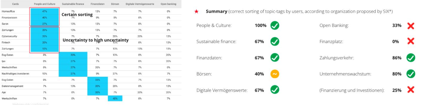
The high rate of misallocated topics led to removing 'Open Banking', 'Financial Center', and 'Finance & Investment' as categories.
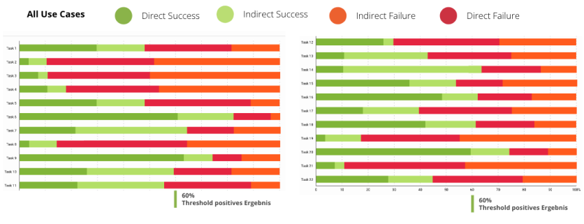
Validation via Tree Testing
To evaluate the findability and discoverability of future blog article titles and to further validate the newly established category and topic setup, I conducted an online tree testing with 25 participants using UXTweak.
With the help of 22 use cases, participants allocated blog article titles to their respective categories and topics. The participant criteria required individuals to be either interested or knowledgeable in finance and stock trading.
For example:
• „Where would you find an article on the topic: Cash supply: 4 strategic balances on the road to the future.“
• „Where would you find articles on:
Diversity/inclusion month at SIX: One month, one topic, many perspectives.”
Key insights Tree Testing
The results of the tree testing indicated that most participants were not as familiar with technical financial terms as they had rated themselves in a pre-test survey, falling into the category of "greenhorns."
Specifically articles referring to categories like "Financial Literacy" were not recognized and systematically categorized incorrectly, leading to it being reassigned as a topic instead of a category.
·The category "Digital Assets" was seemingly not connected with "Crypto" and was misunderstood. This led to the renaming of "Digital Assets" to simply "Crypto".
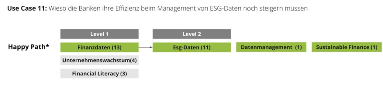
Example result for a task referring to financial data, along with its happy path.
Final Outcome Challenge 1
The final outcome of the card sorting and tree testing was a validated and comprehensible list of 7 article categories and 26 accompanying topics that potentially better match the readers' mental model and expectations of future blog article.

Challenge 2: Blog Redesign
The previous SIX online blog featured only four categories for dividing articles.
To reflect the new information architecture with categories and topics and to improve discoverability and findability of articles within the blog, I planned to introduce a content clusters that links similar or new articles on various page levels.
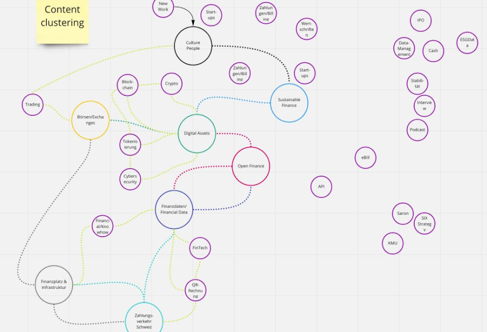
A first early concept model of a content cluster for the new SIX blog
Step 1: Understanding
To gain a clearer understanding of the usability issues the old version of the blog was facing and the problems users might have with it, I conducted a thorough UX expert review. This generated a comprehensible list of recommendations and improvements that needed to be incorporated into the new blog design in the next step.
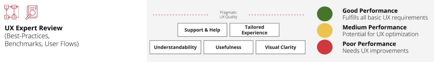
I applied the above criteria in the expert review, incorporating the ISO-9241 standards (excluding satisfaction) and Nielsen Norman heuristics. In this context, usefulness encompasses both effectiveness and efficiency.
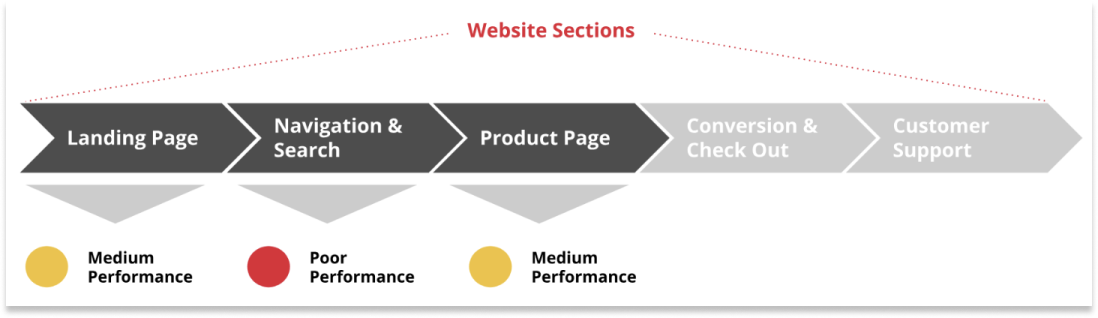
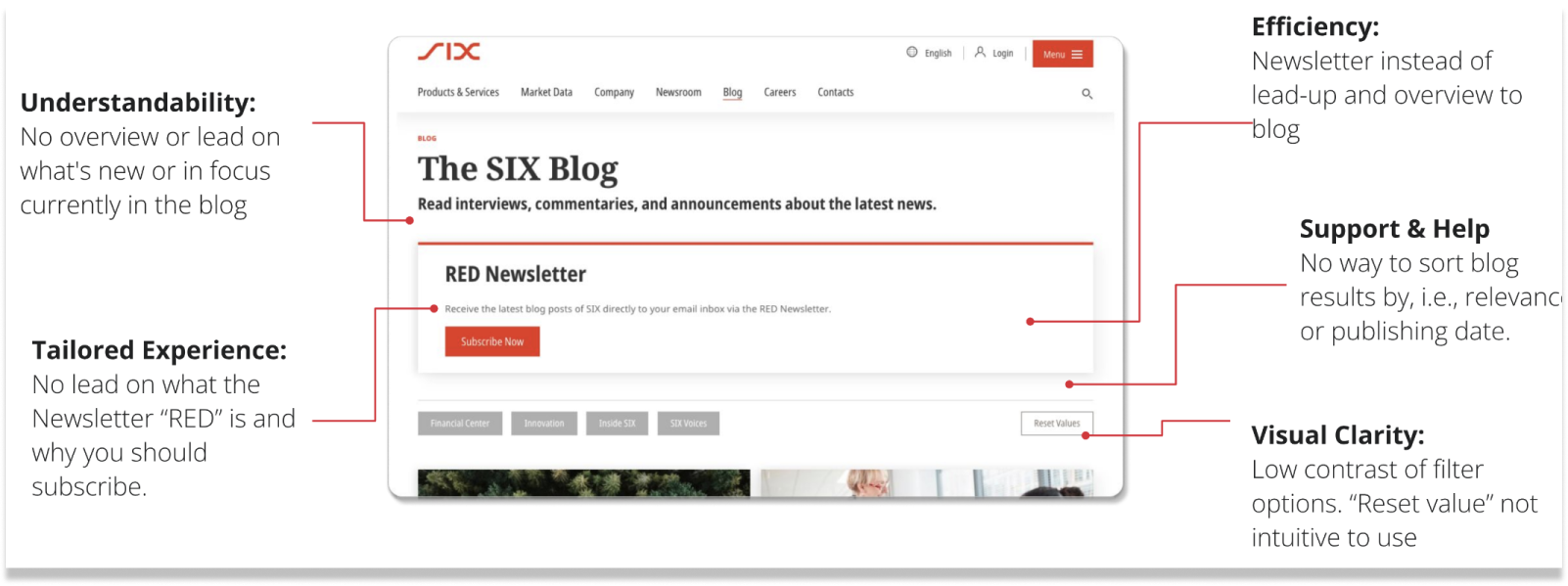
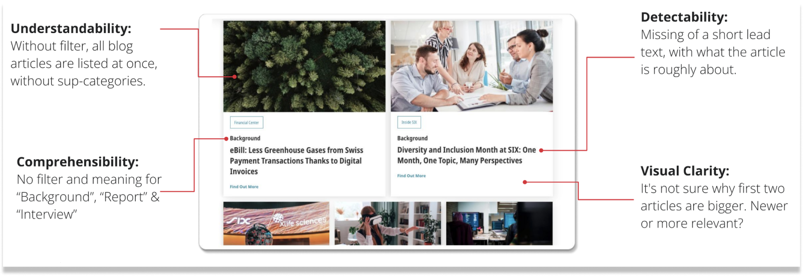
Overall, and unsurprisingly, the blog showed medium performance on landing pages and product pages (articles), with significant issues in understandability, efficiency, and visual clarity. Particularly critical were the navigation and search options, as the current filter options were insufficient for handling the large volume of diverse articles.
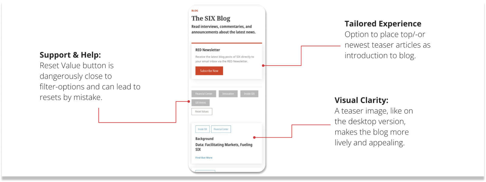
All findings were consolidated and presented to stakeholders.
Below are a few example extracts:
Ideation
After the UX audit, a workshop was held to focus on expectations, the results from the audit and to prioritize initial low-fidelity wireframes, design proposals, and opportunities identified so far.
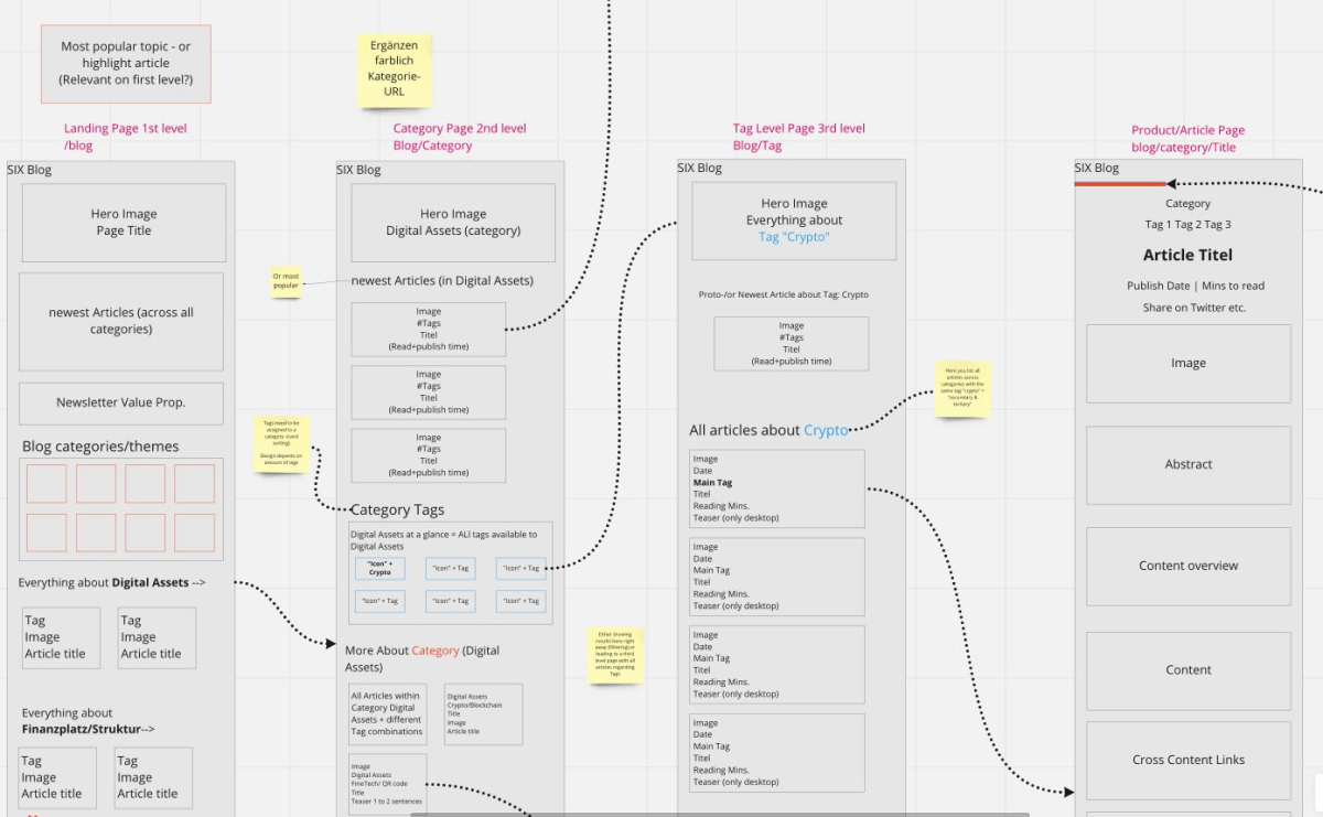
First low-fidelity wireframes conceptualising the three different blog levels
The Concept
In the new blog concept, the goal was to give users the opportunity to explore the blog's content on two levels: category level or topic level.
This way, users can either explore related articles within a specific category or conduct a more refined search for articles across various categories within a certain topic.
This also allows for a better personalized experience, as further articles within similar topics can be proposed to users.
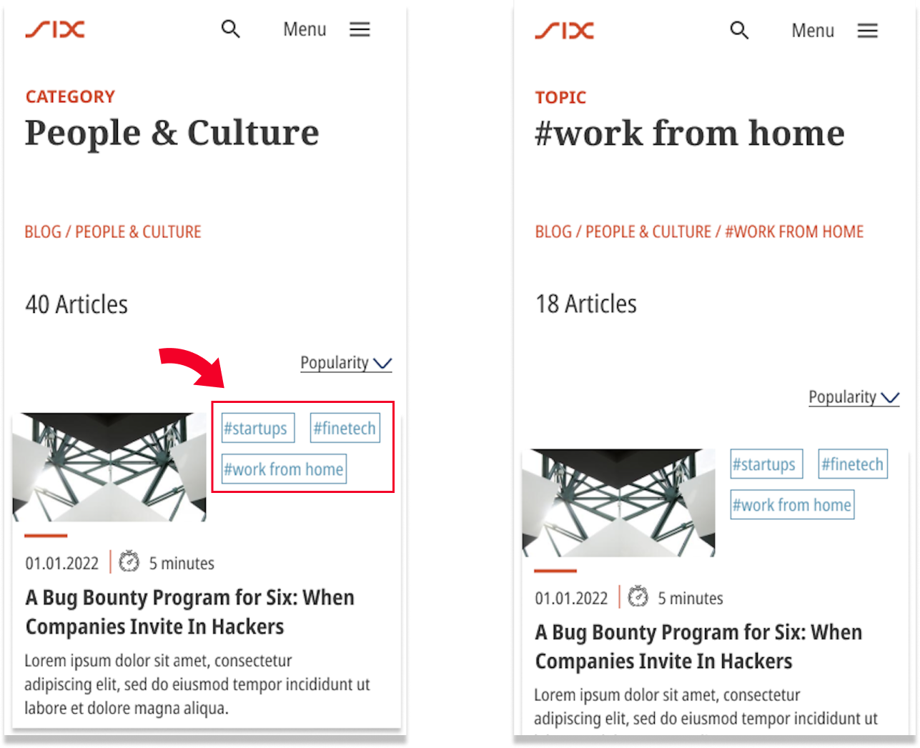
By adding hyperlink topic tags to articles, users always have the opportunity to view related articles or discover more relevant topics, by clicking on, or filter through them
Outcome
Through three design iterations and frequent stakeholder workshops, I built a set of high-fidelity wireframes that were ready to be user-tested.
Design Validation
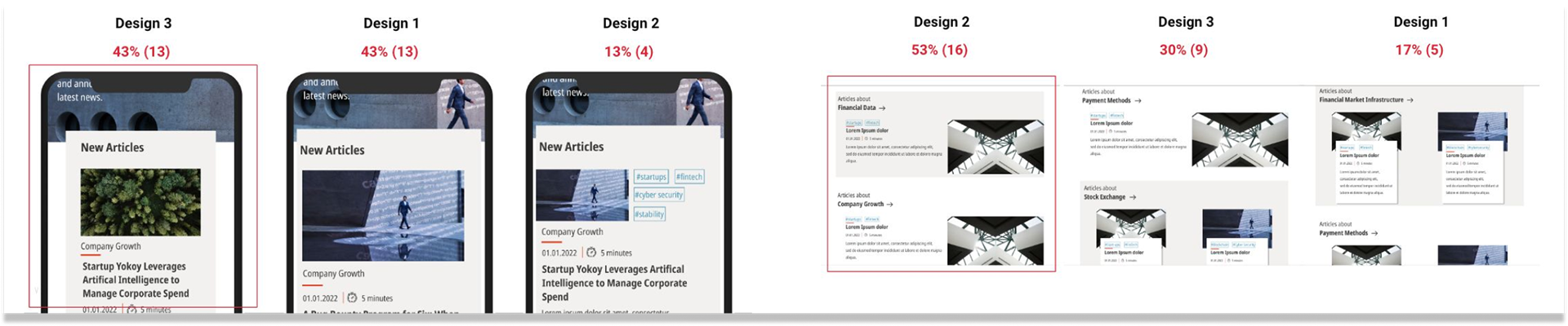
To validate different plausible design variants of the new blog designs, I conducted a preference testing with 30 participants over UXTweak. I chose remote online preference testing due to its cost-effectiveness, time efficiency, and validity for the given questions.
Overall, six designs were tested, each with three design variants for users to vote on.
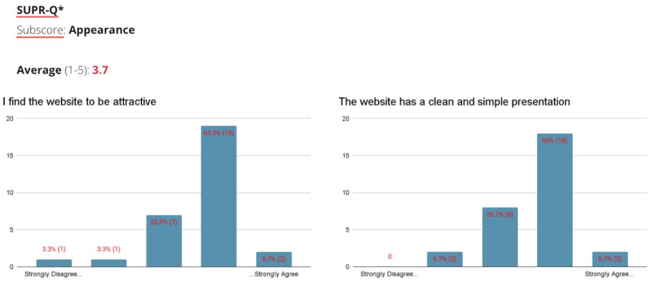
To have first early design user input about general appearance and attractiveness of the new blog design features and if users would return or recommend such a blog in the future, I included the SUPR-Q (Subscores Appearance and Loyalty), as a post-study questionnaire. Which users had to answer after the preference testing.
The SUPR-Q consisted of three questions:
• I find the website to be attractive. (Appearance) (Likert-scale 1-5)
• The website has a clean and simple presentation. (Appearance) (Likert-scale 1-5)
• How likely are you to recommend this website to a friend or colleague? (Loyalty) - (NPS) (rating 1-10)
Key Findings
The preference testing provided clear insights into users' preferred designs, indicating the overall design direction that users leaned towards. In cases where the voting resulted in a tie, we chose the design requiring fewer development resources.
Example output:
The majority of users rated the appearance as attractive and straightforward on the SUPR-Q subscores.
Overall, the presented designs received positive ratings for both attractiveness and simplicity, indicating the project was on the right track.

Result
The final project deliverable was a set of 10 mid-fidelity wireframes (desktop & mobile) for the blog platform, ready for the client to start development in an next step.
The redesign of the information architecture, along with its integration of a content cluster, significantly improves the user experience on the blog by enhancing visibility and findability of individual articles.
Additionally, the new URL setup, which now includes categories and topics, improves discoverability on search engines like Google.
Users now can easily search and discover articles within specific categories and related topics.
My design went live in fall 2023. Explore it here.