Project Overview
The airport parking service at Zurich airport is one of the main revenue drivers for the Flughafen Zurich AG. Their offering allows users to find and book parking spots in either their parking houses or open-air parking areas near the terminal of choice.
They also provide additional services such as access to VIP lounges, additional car insurance options, and accessibility features for people with special needs.
In preparation for a website relaunch, Zurich Flughafen aimed to better understand how users perceive and search for information about their parking options on the main website. This insight would allow them to better adjust their offers to user needs and behavior.

The Challenge
• The Flughafen Zurich team was unsure how users find and understand information about car parking options.
• We didn't know, what information is important to users when initially looking to park at the airport.
• It was unclear if users were aware of additional services and information on flughafen.ch regarding parking.

The Goal
• Understand how users search for and use additional information about parking services at the airport Zurich.
• Evaluate if the finding of a parking option and booking process is user-friendly and efficient.
• To summarize and prioritize findings into a comprehensive list of opportunity areas.

Impact
With the help of the usability testings, I answered the initial research questions and discovered 5 new opportunity areas to improve the experience on flughafen-zuerich.ch.
I framed the findings to encourage a productive discussion and highlighted actionable insights to aid the team in making strategic decisions for the upcoming relaunch.
As a result several of my key opportunities made it into the relaunch...
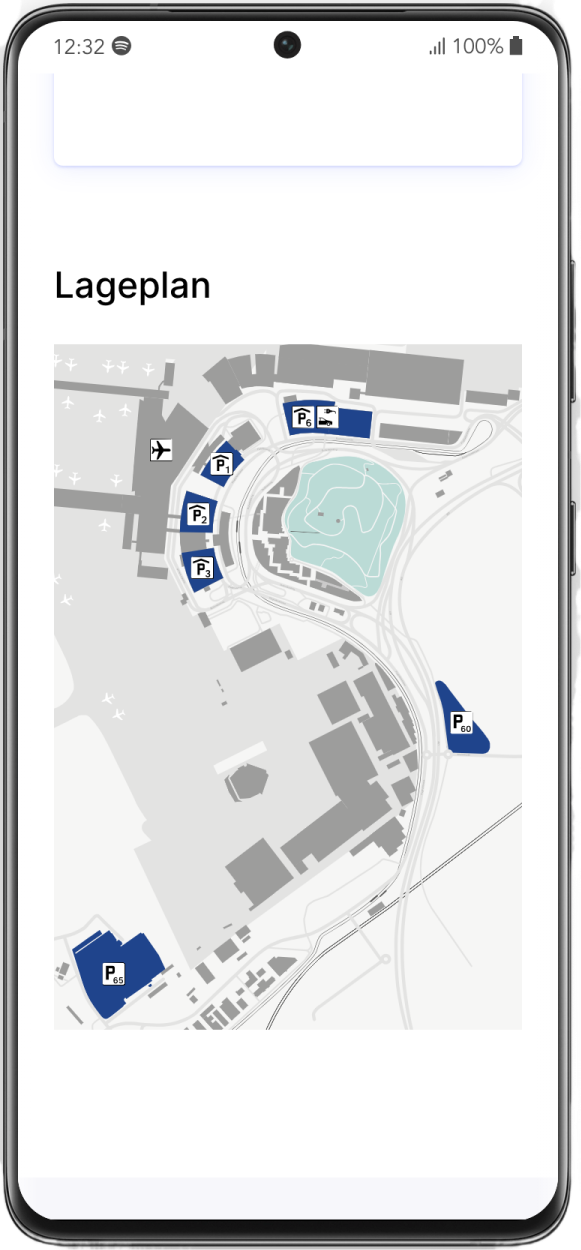
Added a simplified map
A simplified map showing the location of all parking houses relative to the airport was added for better orientation.
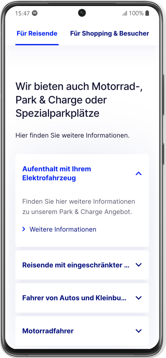
More prominent display of value propositions
The general amount of informational text was reduced, and important information like pricing, location, and special offers were displayed more prominently.
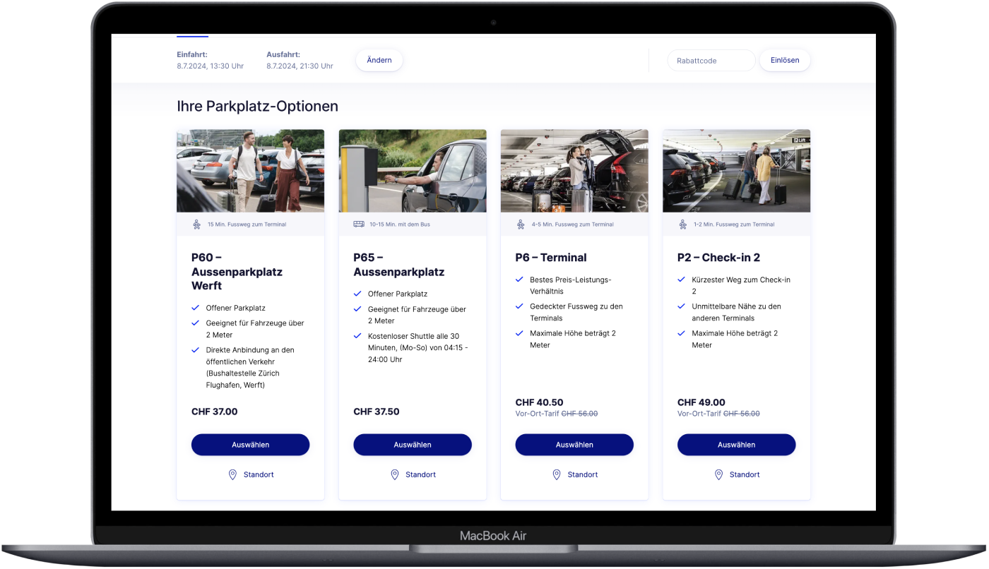
Improved overview and comparison of options
To offer a better overview of available parking options, the number of options was consolidated and made comparable on one page on desktop.

Process & Methodology
The Zurich Airport product team (product managers, designers) was exceptionally motivated and eager to contribute to the UX research process. I encouraged their active participation in workshops, inviting them to share their assumptions and discuss points of interest.
This collaborative approach helped address early questions about the research focus and trajectory.
Scoping Phase
After a collaborative kick-off workshop with the client, the first step involved a thorough UX expert review of the current customer journey involving the digital experience around car parking at Flughafen Zurich.
UX Expert Review
I reviewed flughafen-zuerich.ch to highlight UX pain points regarding all information about and around the car parking services and experiences, focusing on UX writing, general on-page placement, and highlighting of information.
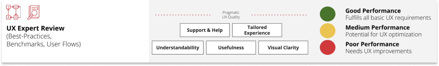
I applied the ISO-9241 standards (excluding satisfaction) and Nielsen Norman heuristics. In this context, usefulness encompasses both effectiveness and efficiency.
To further develop a first impression and overview of what content is primarily viewed by users regarding parking, I conducted a short analytical review in Google Analytics and Hotjar. All insights and arising assumptions were mapped on Miro.
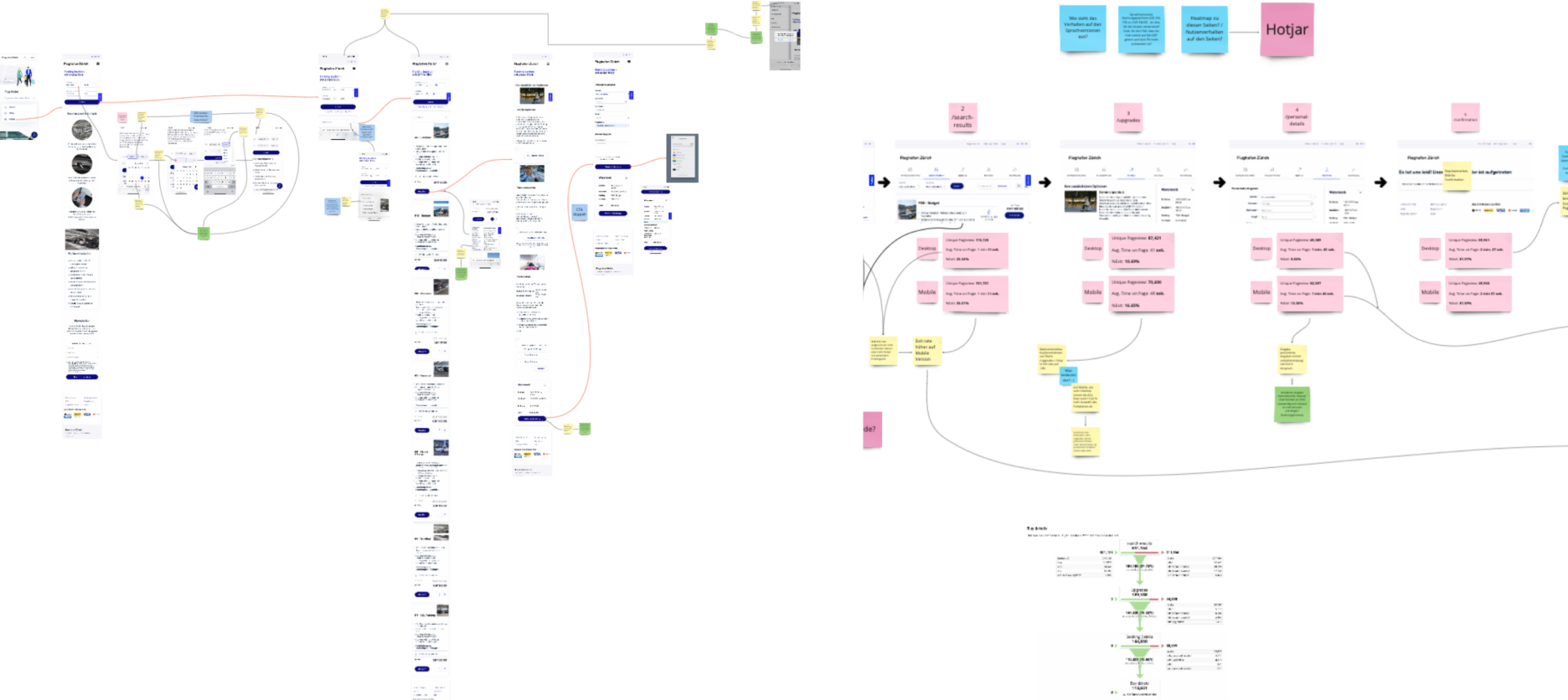
Insights were documented and shared on MIRO
Key Findings Expert Review
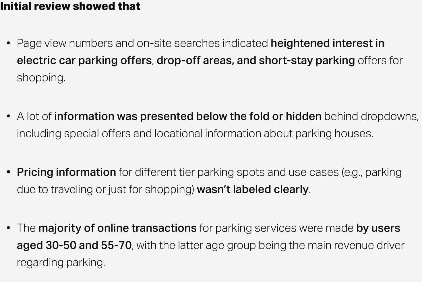
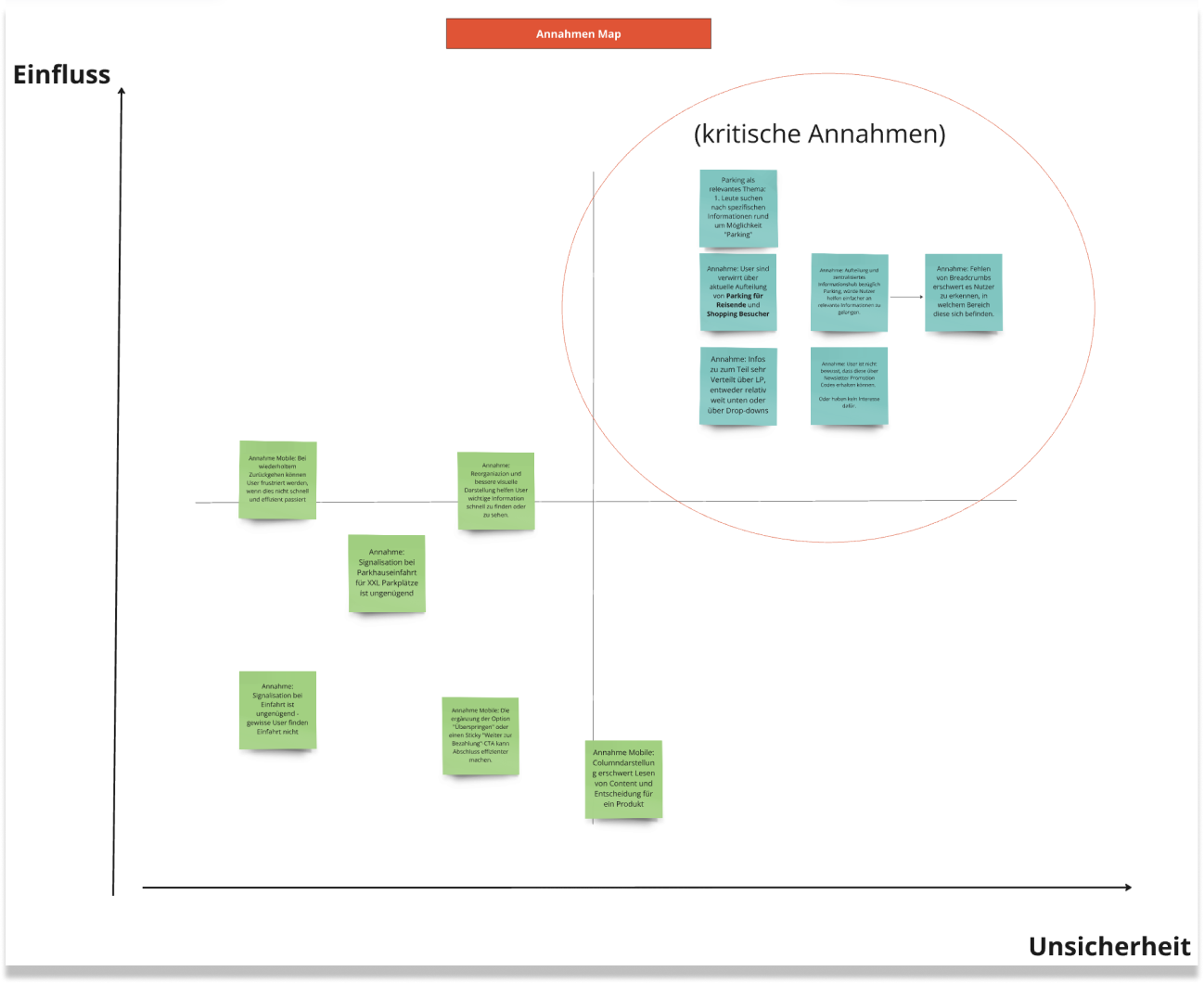
All resulting insights were presented to the team, and additional assumptions added during a workshop.
To aid in better prioritization, all assumptions and hypotheses were mapped on an assumption map.
To aid in better prioritization, all assumptions and hypotheses were mapped on an assumption map.

Research Phase
In a subsequent workshop with Flughafen Zürich, the prioritized insights and assumptions were consolidated.
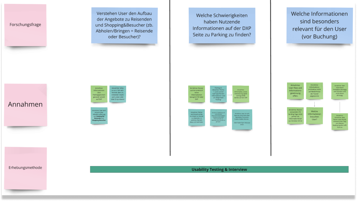
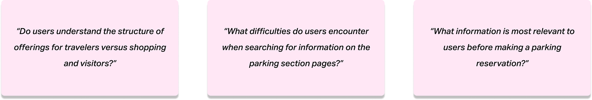
Three important key research questions for the usability testing phase were defined from them
Remote Moderated Usability Testing
To address all the research questions I chose to do a usability testing and developed a testing plan that incorporated three scenarios for participants to play through on flughafen-zuerich.ch:
Scenario 1 (E-Car)
You own an electric car and want to find out if it is possible to park and charge your electric car at Zurich Airport for several days. If so, where can you do this and what are the costs?
Scenario 2 (Pick-Up & Shopping)
A close friend has asked you to pick them up from Zurich Airport the next day. They will arrive at 3:00 PM and wait at Arrival 2. You also plan to run some errands and arrive at least an hour before their arrival. You want to find out where to park your car and the cost of combining pick-up with shopping. How do you proceed?
Scenario 3 (Travel)
You plan to go on vacation from May 16th to 20th, departing from Terminal 1. You plan to drive to the airport and want to find a parking spot as close to the terminal and as affordable as possible. How do you plan your trip and parking?
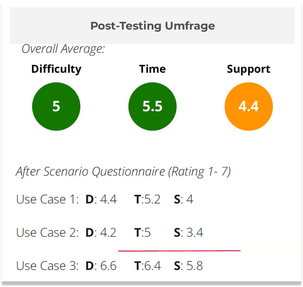
ASQ (After Scenario Questionnaire)
To gain a better understanding of how users felt after each use case, I followed up with the ASQ, asking participants to rate their experience on a scale from 1 to 7 (1 = "strongly disagree" to 7 = "strongly agree").
1. Overall, I am satisfied with how easy it was to complete the task in this scenario.
2. Overall, I am satisfied with the time it took to complete the task in this scenario.
3. Overall, I am satisfied with the information (descriptions, documentations) provided to complete the task.
2. Overall, I am satisfied with the time it took to complete the task in this scenario.
3. Overall, I am satisfied with the information (descriptions, documentations) provided to complete the task.
The testing concluded with a two-question open feedback interview about the experience in navigating the website and its contents.
Target group criteria
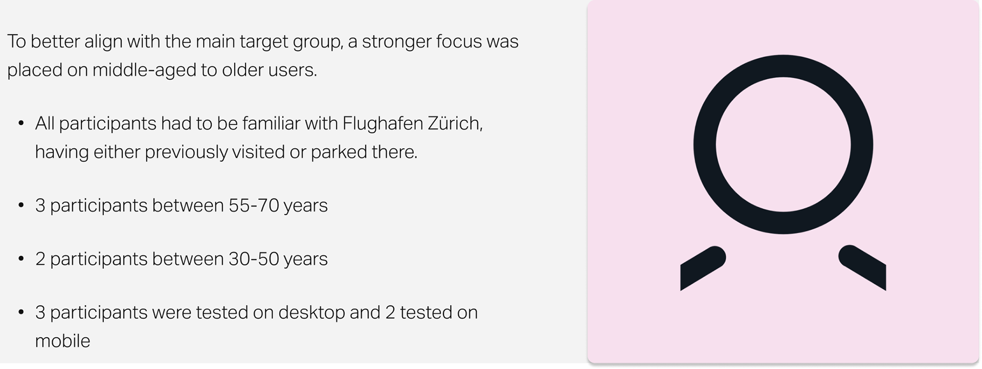
All 5 participants (mixed genders) were recruited through TestingTime and tested via Lookback, with an average test duration of 45 minutes per participant.

Synthesis Phase
After moderating the session, I analyzed the findings and clustered them on Miro to understand:
1. How easily do users find E-car parking offers and pricing information?
2. Do users understand the division of offers into parking for travelers and shoppers/visitors?
3. How do users plan and find an affordable parking spot for extended absences?
2. Do users understand the division of offers into parking for travelers and shoppers/visitors?
3. How do users plan and find an affordable parking spot for extended absences?
Initial Findings ASQ
The ASQ results indicated that participants generally had a satisfactory experience solving the scenarios (d) within a reasonable amount of time (t).
After scenario 2, A learning effect was expected and seen to improve user ratings regarding the system's support (s).
The low scores in support indicated dissatisfaction with the amount of help and guidance (interface, content, or hints) provided by the website, confirming audit findings that information was hard to find.
Initial Findings Scenarios
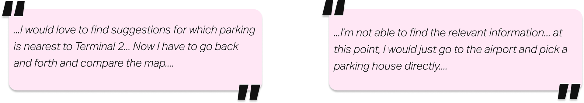
Participant feedback made it clear that crucial information was often not where expected.
1. Similar Structure of Pick-up/Drop-off and Visitor & Shopping
Two participants confused Pick-up/Drop-off with Visitor & Shopping and were looking for drop-off information on the "Visitor & Shopping" page.
2. Visibility of Value Propositions
All participants didn't initially scroll below the fold or click on a dropdown to find needed information (e.g., E-car parking or pricing lists) and prematurely navigated to a different section.
3. Information Overload
Four users were overwhelmed by the amount of detailed information on parking options and only skimmed most of it. Furthermore, many expected an easy way to compare or filter for parking options.
Information about early bird offers and cancellation protection was often not found. Participants, especially those in the age group 50-70, had difficulty finding and discerning information.
At this point my two main goal were to:
1. Focus in on what the most actionable insights for the team were.
2. Help them prioritize them in a consolidated opportunity area list.
2. Help them prioritize them in a consolidated opportunity area list.

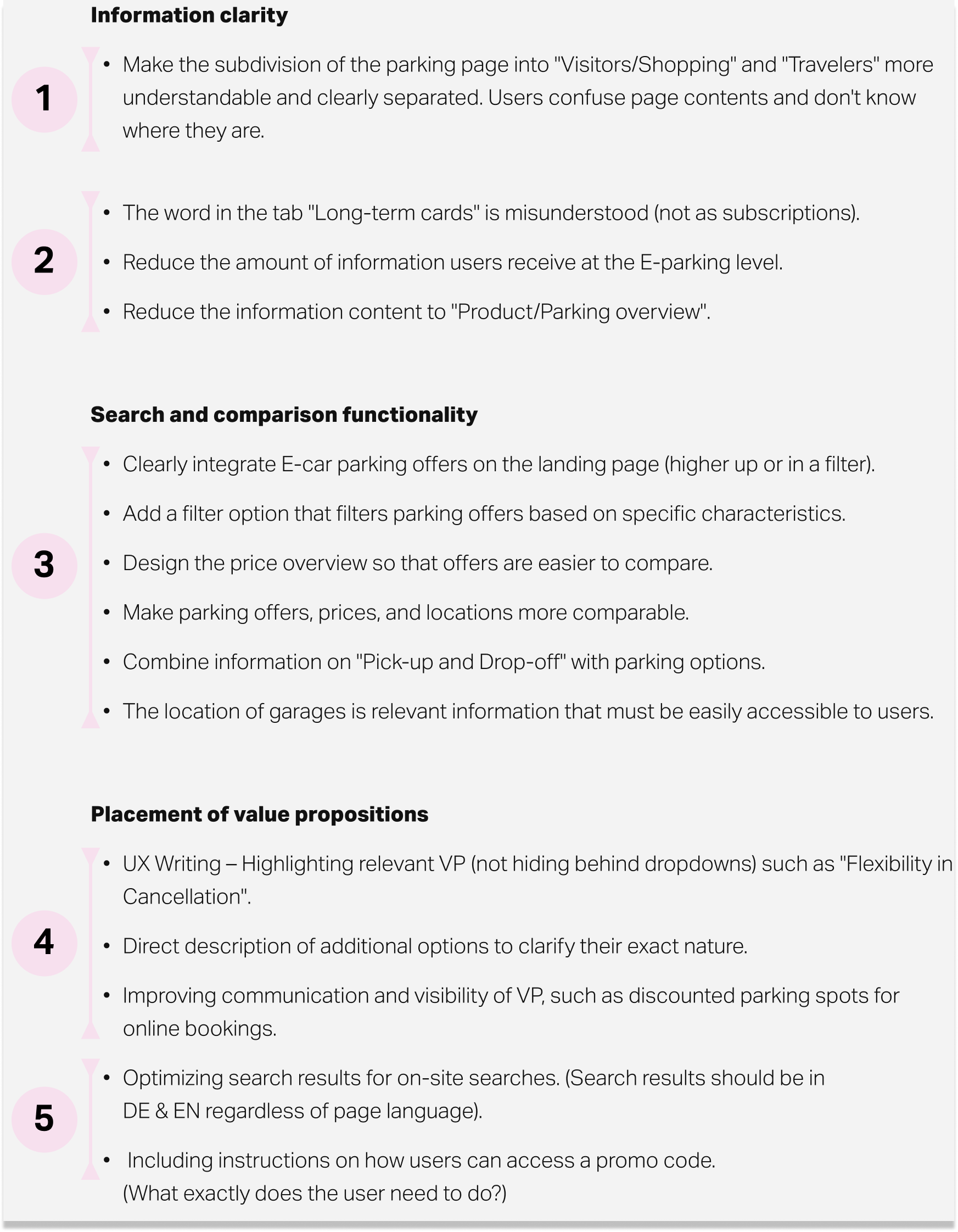
Result
All insights from the usability testing were assessed and categorized into three main groups: information clarity, search and comparison functionality, and the positioning of value propositions.
Key opportunities within these categories were prioritized using the ICE Score (Impact x Confidence x Ease) and presented to stakeholders during a final workshop, concluding the project.
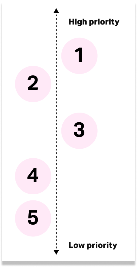
Final prioritization of opportunity areas 1-5
Key opportunity areas